Click a logo for a project overview
Restoration Health
Señor Chulo
Evolve Chiropractic
Beaumont Sausage & Boudin Co.
11th Street Cowboy Bar
Ilario’s Italian Cuisine
Deer Creek Whitetails
Reliance Architecture
Ligon Construction Co.
Backyard Republic
High Culture Brewing
Ecoland Design Group
5 Soul Wine Co.
Comfort Vintage & Bloom
Sisterdale Distilling Co.
DropKick Soccer
Momma Method Personal Organizing
Maeker’s Sausage
18Seventy Brewing Co.
The Republic Kitchen + Bar
Good Pickle Juice
Good Pickle Juice came to us in need of a full branding rollout for their new pickle juice product. They use quality ingredients with no artificial chemicals and needed a logo and package design that was different and less “watered down” than the competition. Through our creative process and competition research we delivered on putting a product on the shelf that was more appealing to the target market, and set them up for success by laying down a solid branding foundation. Look for Good Pickle Juice to hit shelves in late 2020.
If you or someone you know need help with branding a product and/or package design feel free to contact us and discuss your project. Did you know Left Hand Design is featured as one of the Best Food and Beverage Branding Agencies on TopBrandingCompanies.com? We’re also one of the Top Food and Beverage Branding Agencies according to Design Rush. Check it out!
ATX Sports+Adventures
ATX Sports+Adventures is a recreational sports league based in Austin that’s been around since 2011. They came to Left Hand Design in need of a new logo design and rebrand as they push to become one of the top recreational sports leagues in the nation. With over 3,000 members across more than a dozen sports leagues they needed branding that was going to set them up for success for years to come.
Like all branding projects, we started with the logo design. This logo was a challenge. They needed something “Austin”, something versatile since the same logo will be on every members shirt regardless of what sport their playing, and a logo that would transition well in 1-color and multi-color applications. Through multiple rounds of logo designs and revisions we landed on the idea of brackets that make up a court (or field), encompassing the initials ATX. Brackets because that’s what every sports league comes down to, a court because you can’t have sports without a field of play, and ATX because… well, ATX.
Once the logo was complete we hit the ground running. We designed a slide deck template for them to populate as needed, poster designs, t-shirt designs, an email template and a fully custom and easily editable WordPress website that allows members to track stats and sign up for events across the board.
This was an exciting project for us to tackle, and we made some good friends along the way.
If you’re in need of a logo design or a similar full spectrum branding package feel free to contact us here. We look forward to hearing about your next project!
GreenWave Naturals
Austin Foodstagram
Rachel Holtin from Austin Foodstagram has been a good friend of Left Hand Design since she began her Instagram presence. We met her when her passion for food blogging in Austin had began to gain traction at around 15k followers, at that time the Austin food scene was begin to boom and she knew she was onto something. Fast-forward 4 years to 80k followers and Rachel was ready up her game with a new website.
She was on Squarespace, which is a great platform and we do lots of Squarespace web design, but WordPress was definitely our recommendation based on how she wanted to grow and implement custom functionalities. We have a streamlined process in how we tackle websites and there’s a lot of things to consider:
Do you have an existing website?
What’s the purpose of your website and how do people reach out?
Are users getting the experience they deserve?
Is your foundation set up for success in SEO?
… to name a few.
We dove in and developed a WordPress website that will serve as a powerful tool for Austin Foodstagram for years to come. At the end of development, we create a custom video walking you through how to use your website, we can provide custom Photoshop templates for sizing your images, and we’ll even celebrate over some drinks while answering any lingering questions you may have (see pic below).
We look forward to seeing Rachel grow with her new website, and we’re here every step of the way as she needs a helping hand in design & development.
If you or someone you know if looking for a WordPress website design please feel free to contact us about your next project!
Riley Herbst NASCAR Driver
Riley Herbst was born with a need for speed. He began racing karts at the age of 5 to eventually live out his lifelong dream of becoming a NASCAR driver. At age 19, young and hungry, Riley needed a logo design that could sit on a page and look as fast as the car (or truck) he was driving. So he reached out to Left Hand Design in hopes he could establish a brand that would stand the test of time and build the foundation for the long road ahead… pun intended.
We honed in on what Riley was after, “something that looks fast using the initials RH.” Several concepts were presented, but we love what Riley chose as the hero. Like all logos we design he was given a full array of lockups to fit in any application he needed to throw his logo on… a hat, a shirt, a website, the doorframe or hood of a NASCAR! He’s covered.
If you or someone you know if looking for a sports logo design (or you happen to know another NASCAR driver needing a logo) please feel free to contact us about your next project!
The Studio at thinkEAST
The Studio at thinkEAST is a 182-unit affordable housing community that is part of the 24-acre thinkEAST development project in East Austin. It offers affordable living and working arrangements for families earning 60% of Austin’s median family income. On top of that, it’s caters solely to creatives – including technology, design, music, film and lots more. Needless to say, we were excited about this project.
The Studio at thinkEAST needed a professional-modern feel for their logo design and branding to match the architectural style of the property. We studied renderings and interior plans to develop a style that fit naturally into what they already had in place. The building illustration of the logo resembles the slanted roof style to the front of the complex, and the typography and composition play off the creativity-fueled environment it’s destined to become.
If you or someone you know if looking for a housing or apartment community logo design please feel free to contact us about your next project!
St. Andrew’s Episcopal School
St. Andrew’s Episcopal School in Austin reached out to Left Hand Design in need of a rebrand for their new mascot. Having been around since 1952 with over 900 K-12 students, and spanning over a dozen sports, this was no small task. St. Andrew’s went from being The Crusaders to The Highlanders as voted on by students, parents, and faculty of the school.
We researched the possibilities for how best to represent a “Highlander”, knowing the client wanted an animal mascot. After providing several directions we landed on the Red Deer, native of Scotland, and took off with the project.
We developed the entire branding rollout for their athletics program, and assisted them in getting ready for the big unveil on the students first day of school for 2018. We’re grateful for the opportunity to work with St. Andrew’s on their rebrand, and proud for how everything turned out.
If you or someone you know if looking for a mascot logo design please feel free to reach out to Left Hand Design by hitting our contact page.
Uncultured Ales
Uncultured Ales is a microbrewery located in Austin, Texas. They hired us to create a full branding rollout which included a brewery logo design, beer package design, and other elements to make them stand out among a highly competitive market.
The beer they produce stands out on it’s own. You might consider these “farmhouse style” beers, but Uncultured Ales takes it a step further. All their beers are brewed more traditionally in the way they harvest and propagate the agents of the fermentation process. This tends to produce beers that are not quite as consistent as maybe you’re used to, resulting in more of a sour or acidic taste. The natural flavor profile enhances as it moves from fermentation to barrel aging, even continuing to develop after it’s bottled. This means these beers can sit in the bottle for quite some time prior to consumption.
The uniqueness of Uncultured Ales fit perfectly with the beer-loving make-up of Left Hand Design. Match made in heaven.
If you or someone you know is in need of a brewery logo design or some beer package design, please contact us. Did you know we are recognized as a Top Beer Logo Design Company and one of the Top Beer Branding Agencies on DesignRush? Our passion for beer goes hand-in-hand with the ones creating it, and our creativity thrives in projects we love.
Growler Express
Growler Express is a growler bar in Buda, Texas. With indoor and outdoor spaces and a huge selection of beers on tap, these guys aim to take Buda to the next level in the beer world. Our logo design will be featured on signs, pint glasses, t-shirts, growlers, coasters, koozies, you name it. They wanted something that appealed to beer lovers, and liked the idea of a contained seal logo for their mark. The hop-leaf growler icon establishes the brand and will work well as a design element in their branding. Keep an eye out for these guys, more project posts to come!
At Left Hand Design we absolutely love doing logo designs for bars. If you are a bar or restaurant in or outside the Austin area looking for a logo branding package put together for you, don’t hesitate to contact us.
The Stage at Waterstreet
The Stage at Waterstreet is a live theatre organization and acting company coming to Austin, Texas in 2019. It’ll include a wide range of live performances and musicals in it’s space, located just off Cesar Chavez and IH-35 in downtown Austin. The Stage at Water Street approached us for logo design and branding to get their foundation set as they work towards their grand opening. They wanted something modern and friendly, with an emphasis on the word STAGE. It also needed to scale down easily as a strong icon shown on social media platforms and printed small on ticket stubs, we felt the seal logo worked perfectly for this.
As more projects come through Left Hand Design for The Stage we’ll post them here, and we’re really happy to be brought in on such a cool project.
Did you know we’re featured as a go to branding agency on Design Rush?
Ghost Light Lounge
Ghost Light Lounge is the coffee shop / bar attached to The Stage at Waterstreet in downtown Austin, set to open in 2019. For those who don’t know, a “ghost light” is the light on a stand (usually in a cage) on a theatre stage when the stage is not being used. See examples here. The logo design needed to have some continuity between it and The Stage logo, as they’re owned by the same company. We kept the same seal shape with the outer line to bring the two together visually, the type at the bottom of the seal was also the same font in both logos.
The light bulb icon is the hero here, as it’ll be used as a design element throughout the space. The dark blue and yellow colors contrast well with the navy and light blue of The Stage seal. Ghost Light Lounge will also remain open during the day when The Stage is not open, so it also needed to work as a standalone brand so as not to assume it’s only open when The Stage has a performance running.
Stay posted here as this project develops and construction breaks ground, we’ll looking forward to seeing this one come to life.
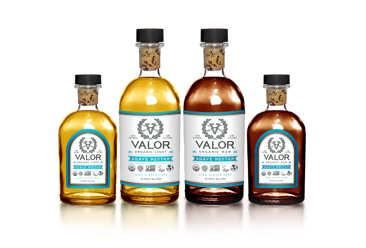
Valor Spirits
Valor Spirits came to Left Hand Design with an existing logo in need of some package design for their products. To start, they wanted some agave nectar labels that would pop off the shelf amongst the competition. The blue agave’s they use are grown on a family farm in Mexico, and a portion of all proceeds are donated to various veteran charities. This is the highest certified agave nectar on the market, seriously, it’s GREAT stuff. This veteran owned company is just starting out, but they’ve got a bright future ahead. Look for more package design and more from LHD as they continue to grow. Did you know know we’re a featured agency on DesignRush?
Are you in need of some product package design that will jump out on a shelf? Contact us today and we’ll discuss your needs and how we can help.
SWE WE Conference
The World’s Largest Conference for Women Engineers came to Austin in 2017 and needed a graphic to accompany their event branding with some Austin flare. Bats, tacos, cranes, and music were all considered for the concept – but in the end we went with a food truck full of desserts. This graphic was printed large and small throughout the event, and played right into the line of food trucks outside the convention center when it was break time. We had fun with this one.
Social Betty’s
Social Betty’s is a mobile craft company based in Austin, Texas that brings arts, crafts, and project plans to your home. Freakin’ cool right?! They needed some branding that would properly represent their swagger, so we got them set up with a cool new seal logo and full branding rollout to get things kicked off. Whether you’re looking to entertain a group of kids, or having a mom’s wine night building new wooden picture frames, reach out out to Social Betty’s for a really cool experience brought to your door.
Scallon Ranch
Scallon Ranch came to us in need of a logo design and branding for their ranch property in Mason, Texas. The property will serve multiple purposes ranging from wedding and events to raising livestock for processing. And that’s just the beginning. It was important to create a brand for them that they could expand on, so each division could be sub-branded under Scallon Ranch and retain a sense of consistency throughout the business.
Like any ranch in Texas, they deserve a solid brand design. Something they can ingrate into their front gate, stamp on cattle, embroider on shirts and hats, among other things. The SR monogram design was the hero of this project.
Next up we branded the wedding venue, called The Park at Scallon Ranch. The consistency is there visually under the Scallon Ranch name, and we chose a different color palette to separate itself, a trend that will likely continue as more sections are added.
If you or someone you know is in need of a Texas ranch logo design please feel free to contact us for more information.
5020 Restorations
When a client says they’re moving to Austin to open a hot rod shop and they worked for one of the largest chassis and custom car makers in the nation, you don’t take it lightly. Left Hand Design developed a full branding package for 5020 Restorations to put them on the map in Austin, they’re brand spankin’ new but keep your eyes peeled for their work. Lots more to come on this project, stay tuned.
Facial Focus Cosmetic Surgery
Facial Focus Cosmetic Surgery came to us in need of a logo design for their new practice. They cater to both men and women for surgical and non-surgical cosmetics, along with hair restoration. The logo design needed to reinforce health, safety and professionalism as a prime component of the practice. The caduceus (two snakes mark) is very popular among healthcare practices, and it’s difficult to make it stand out among the others. We created a shield with the two F’s that also mimics the wings of an original caduceus mark, combined with the snakes and staff we landed on a solution that was perfect for them.
If you’re opening a healthcare practice and are in need of a doctor office logo design feel free to contact us by clicking here. We have an extensive portfolio of healthcare related projects and can build a brand for you that will serve you right for years to come. Did you know we’re listed as one of the Top Small Business Branding Agencies in the US? Click the link to learn more.
Perfect Countertops
Perfect Countertops came to us in need of a logo design for their new countertop installation business. Installing countertops is all about angles, so we carried that through into their logo design. We even came up with their slogan, “Perfectionists in Craftsmanship.”
If you’re in the construction industry and are in need of some branding assistance, we’re currently looking to develop a custom homebuilder logo design for our project portfolio. We love working with individuals that build, let us push the pixels while you shape our cities. Contact us today.
Myologic Massage
Myologic Massage hired us to create the branding for their new business. They specialize in deep tissue massage, neuromuscular therapy, sports massage, myofascial release, cupping and orthopedic massage – quite a lineup of services! And they do great work. They needed a logo design that fit the bill for the quality of service they provide. We designed a custom monogram for the branding that scales nicely to different applications, from simple design element to a custom pattern, the design possibilities are endless. They even carried the hexagon theme throughout the entire buildout of their location, giving it a seamless transition from a user that visits their website to visiting their location to get a massage.
Once the branding and logo design was set we worked up business card designs, a gift card design, a custom Squarespace website design and more.
If you’re in the spa industry and or similar field and need help with a logo design contact us today!
Lock Lizard Lures
Lock Lizard Lures provides the only freshwater lizard lure on the market. Hard to believe, but it’s true. They needed a logo design to incorporate into packaging, on promotional materials, and would look good in a sea of sponsor logos on fishing boats and gear at fishing tournaments. Stay tuned for package designs and more in 2018!
Legacy Bone & Joint
Legacy Bone & Joint specializes in orthopedics and sports medicine, just like it says in the logo! How bout that? They came to us in need of some branding that would set them apart from other doctors in the area. They wanted to incorporate a mark that would stand on it’s own, something that ties a bunch of services together into something solid. When you think of bones and joints, you think of works like connected, attached, solid, structure, skeleton, etc. We felt this abstract mark worked perfectly for their logo design.
Hill of Beans Farm
Hill of Beans Farm is located in Simpson, Louisiana. A working husband and housewife with four kids run the farm that has everything from crops to animals. They set up shop at farmers markets around town and distribute food to local stores. They needed a logo that was friendly and appealing for people to see at farmers markets, and eventually would work well as labels on packaging for their products. The family had recently lost their mother and wanted to incorporate a subtle element in the logo that paid homage to her, hence the halo.
Herb & Beet
Herb & Beet (like “Urban Beat”) is a restaurant based in Spring, Texas, right outside Houston. They bring on a solid farm to table menu with locally sourced products, and an Executive Chef with an extensive background. Herb & Beet needed branding that was going to set them up for new life in a very busy market.
We started out with logo design and elements to get their branding set. From there we did the exterior building design which were hand-painted by a local sign-painter in Houston. We developed the restaurant website design built on WordPress so it’s easy for them to edit, along with all the interior menu designs big and small.
Left Hand Design was with Herb & Beet from the beginning, we created a theme from nothing, we worked from blueprints and elevation renderings to put together what stands today, and we’re damn proud of it. We couldn’t be happier for Herb & Beet to have opened in June of 2018, and wish them the absolute best in their restaurant venture.
If you or someone you know is looking for a restaurant design and branding partner, feel free to contact us. We have all the knowledge you need in getting you the right deliverables, and can connect you with a team of people to help bring your vision to life.
Update: Herb & Beet closed their doors in early 2023 due to complications from the pandemic. We continue to stay in touch and hope to work together again with them in the future.
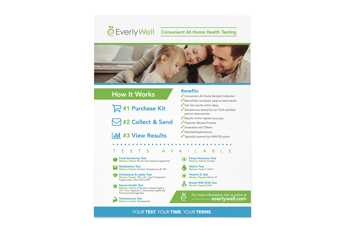
Everlywell
Everlywell provides at-home lab test kits for people who want the convenience of doing tests in the comfort of their home. They came to us in need of some marketing materials for their products. We put together a tri-fold brochure design and one-pager for them to hand out at tradeshows, as well as send along with their test kits. The designs needed to maintain the branding they already had in place, and be an easy read for any customer looking at trying out one of their services.
Embellish Skincare
Embellish Skincare came to us in need of a logo design for their line of products. Once the branding was nailed down we jumped into package design. They were after a simplistic label design that would look nice sitting on shelves in small boutique shops. Because the scents remain the same product to product we color-coded everything to give each scent it’s own color.
Did you know Left Hand Design is listed as a top cosmetic package design company on DesignRush? Click the link to find out more or contact us for more details.
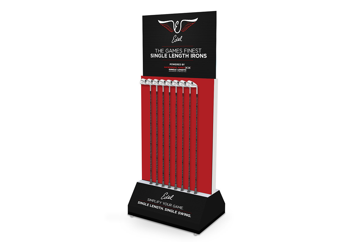
Edel Golf
Edel Golf located in Liberty Hill, Texas needed some signage designed for their displays in PGA Tour Superstores across the nation. Highlighting their single-length irons and wedges, LHD designed signage that would set them apart from their competition, showing the strengths of their product.
When we take on a job like this it involves market research, see what the competition is doing and do it DIFFERENT. In this case, the Edel displays would be the only displays in the store featuring product over a black background, which pop immediately. We helped button up their branding styles to begin setting the standard for more work to come.
If you’re a serious golfer, and you’re in the Austin area, we highly recommend going to these guys to get fitted for some wedges and/or a putter. Everything is custom fit to you, and it’ll change your game. A hands-down really cool experience to see for yourself.
Earth Born
Earth Born is a spinoff of Earth Born Market in McAllen, Texas. While the market specializes in healthy and organic goods, the new location will feature juices, blends, and healthy bowls made of locally sourced farm to table goods. Because they’re an established company they didn’t want to stray too far from their current branding, so we freshened up their existing logo for the new location and gave it a more modern flavor.
Denton OBGYN
Denton Obstetrics & Gynecology came to us in need of some branding for their new practice that was “warm and inviting.” Because there are so many services under the OBGYN umbrella we took the direction of reproduction and ran with that for the three-leaf logo mark. Like most logos we create, we designed multiple versions of their logo so they have the flexibility they need for using the logo in various applications. A full stationary package was designed and printed by Left Hand Design as well.
Bethel Assembly
Bethel Assembly Church rolled out a slogan for 2018 centered around the word EPIC.
Be Epic. Do Epic. Live Epic.
It means to make the most of everything in your day to day life. This is what they preach. They’re not your typical church, the pastors have a free-flowing beautiful way of connecting with the audience. People who attend are mostly blue collar workers and farmers outside Abilene, Texas.
We were hired to create a mark they could stand behind. A logo they could wear on a t-shirt or hat that would create interest from those around them. A way to bring people into the church to learn about what it means to be EPIC.
AO Services
AO Services came to LHD in need of some branding for a spinoff of their main company that puts together large outdoor playscapes. AO Services wanted to target a commercial audience providing services such as putting in basketball & tennis courts, building pavilions and amenity centers, even putting in bbq kitchens and firepits. Because they’re so diverse in the services they provide they needed a logo that was generic, yet memorable.
29 West Realty Group
29 West Realty Group came to us in need of a complete branding package for their new real estate company. They specialize in high-end real estate and wanted a brand that would separate them from their competition, both in look and business style. From gripping listing signs that would pop out of yards to collateral handed to clients as they closed on a new home, the design and branding needed to shine. The list of services we provided includes logo design, listing signs, stationary, pocket folders, stickers, key cut-outs for new homeowners, and outdoor signage.
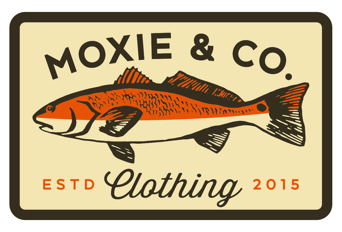
Moxie & Co.
Moxie & Co. is an outdoor clothing line based out of Florida that targets hunters and fisherman. They hired us to create an array of t-shirt designs, patch designs, and pattern designs to roll out into the spring and fall lines for the past couple years. Some of the patch designs were liked so much they also made them into t-shirts, and vice versa.
Mythical Method
Mythical Method Supplements is breaking into the sports supplement game with a line of pre-workout gummies. They approached us with a vision of creating a double-M mark that would represent their brand among an extremely competitive market. We took it a step further.
Digging into the true essence behind the name and targeting the right consumer base, mostly men, we created a mark that was both different from everything else you see on the shelf at GNC and hit on the uniqueness behind their “mythical” product. The double-M dragon was the result. Like every logo we design it included a primary logo, secondary logo and icons for social media.
Next step was packaging. We developed a color palette that worked well as a family for their flavors, and designed packaging for individual pouches for people on the go. We scaled up the designs to larger tubs for those who want to keep a supply on hand, our process always ensures the design will scale to multiple shapes and sizes.
If you’re developing a product and are in need of a product logo design or product package design don’t hesitate to contact us. We have a streamlined process to getting you exactly what you need for your next endeavor. Did you know we’re featured on Design Rush for package design?
Beautymark Agency
Beautymark Agency is a full-service on-site beauty concierge in Austin, Texas. They came to us in need of a new logo design to begin rolling out all the new branding for their small company. The request was to create a monogram design of sorts that could act as a design element throughout their expansion. We delivered, and gave them something to grow with.
We also built a website on Squarespace for them, providing them a footprint on the web with information and online booking capabilities.
Shah IP
This law firm specializing in patents came to us in need of a logo that broke themselves away from your typical law firm branding, something unique. Shah IP wanted a light bulb inside a seal of some kind – that was their direction, and we took off with it.
The light bulb inside the shield portrays the idea of protecting an idea – which is what a patent does. The use of TRD MRK is used in lots of logos nowadays, somewhat of a trend, but I can honestly say the use of it inside this mark was nothing short of perfect.
A complete branding package was made for all applications, including icons for social media.
Texas Premier Baseball
Texas Premier Baseball is an organization that puts focus on competition and player advancement at all levels of baseball in the state of Texas. From youth and high school organizations to college and pro, these guys work with the best of the best that come out of our great state. Did you know Texas is 2nd in the United States for producing the most Major League Baseball players?
The logo will be displayed on the web, jerseys, flags, hats, you name it. It was important for us to create a simplified version of the main logo to be used in smaller applications. The red, white, and blue is true to Texas. We designed a brand for TPB to build on for years to come.
3C Drywall
3C Drywall is an Austin-based drywall company servicing both residential and commercial builds. They came to LHD in need of an identity that would set them apart from the rest when it came to all things construction. We set them up with primary and secondary logos with an icon that gave them versatility in any application. Business cards, vehicle wraps, and a website we designed and developed in WordPress from the ground up came shortly after the brand was built.
Bed & Brunch PR
Bed & Brunch PR is a boutique public relations company out of New York that specializes in creating strategic campaigns for bed and breakfasts, ranches, wineries, boutique hotels, and more. They came to Left Hand Design in need of a logo to help them rebrand. They wanted something vintage that gave new and existing clients a sense of familiarity when they saw it. Using the old Brooklyn Dodgers as our inspiration, we created a timeless mark for their growing brand, complete with a primary logo and an icon for social media purposes.
Fine Pint
Beer! We love it. We’re known to do some home-brewing of our own at LHD, so we jumped at the opportunity to rebrand this local beer blogger, Fine Pint. Trey at Fine Pint isn’t your average craft beer lover. No, this man takes it to the next level. He’s very active in the Austin beer scene, organizing bi-weekly hangouts at different local breweries just to sit around and talk about…you guessed it, beer. We worked up a primary and secondary logo for Trey and a social media icon that looked good online and gave him more options when it came to printing stickers and t-shirts. We customized a classic blackletter font for him to give Fine Pint a unique look and feel with a little German twist. Check him out online Fine Pint.
Diverse Roofing
Diverse Roofing approached LHD in need of a rebrand. They wanted to stray from residential roofing, something they had done in previous years, and focus solely on becoming a commercial roofing company. They needed a logo design that separated them from their competitors, something with a little edge. We designed a logo and various icons for them to use on business cards, marketing materials, work apparel, vehicles, and more. To give them more flexibility, we also created a secondary color palette as part of their branding, which they could incorporate into their materials and online presence.
EcoFriendly Goods
Compost bags made of corn. Let me repeat… compost bags… made of corn. It doesn’t get more eco-friendly than that, y’all. EcoFriendly Goods needed to do some branding in order to market themselves online and some help on their product packaging. At first glance, the logo needed to scream “organic”, so green was the obvious color choice. As a compliment, we created a secondary palette of “earthy” tones that held true to the brand without everything being completely green. We also designed a secondary logo and social media icon to give them greater flexibility. We’re excited to see the different types of green products these guys roll out in the future in their effort to help save our planet.
Mandoo Entertainment
Mandoo Entertainment is a full-service entertainment company that caters to Korean artists, filmmakers, and fans. Since 2010 they have brought Korean entertainment to Austin, Texas, through the likes of SXSW, various tours and showcases, film screenings, and much more. When they came to us, Mandoo needed a rebrand. They wanted something they were proud to display on show banners and posters at live music events, but that appealed to everybody, not just those of Korean descent. They didn’t want the mark to be overly reminiscent of Asian culture, but a subtle influence was encouraged. This was a challenge (though most logos are)! We researched Korean culture and ended up back at one of the first ideas discussed for designing their logo – the Korean flag. The sets of three black bars in each corner are called trigrams, which have meaning depending on their orientation and design. We designed the Mandoo logo with three bars on two sides in different orientations creating the letters ‘M’ and ‘E’ to capture both the flag inspiration and represent the company name. Subtle? Yes, but they got it right away. The logo is topped with a box containing a star, which represents the entertainment services they offer and the idea of bringing everyone together. We dug REALLY deep for this one, putting our own twist on the old adage with a logo that speaks a thousand words.
Villa Antonia
Villa Antonia is a beautiful venue located outside of Austin that hosts weddings and social events. They came to us in need of a complete rebrand and website, in addition to marketing materials, letterhead, and signage. No small task! In the end they were given a new look that appeals to not only people hosting weddings, but others interested in renting the venue for social and corporate events as well – a market they wanted to penetrate for central Texas. The logo design and accompanying marks allow flexibility in print and online applications, large or small in scale.
Bonfire Cannabis Co.
There was just something cool about branding a Colorado marijuana dispensary out of Austin, Texas, where even Willie can’t toke up and be legal! We hooked up Bonfire Cannabis Company with some solid marks to build their brand on. This was not your typical pot-leaf logo with smoke pouring out of hand-rolled joints. BCC aims for a higher quality product with a focus on life and nature, something we wanted to keep central to their branding. We developed a wide variety of logo, color, and icon options for them to carry forward in a number of different outlets. We also tackled their packaging, which was no easy feat due to all the rules and regulations involved with marijuana products. These tiny packages must contain a ridiculous amount of content, so making them look good was a serious challenge. Next time you’re in Boulder, Colorado, and you want to see some Double Rainbows – check these guys out.
JW Materials Management
Sometimes our clients will sketch something up or put something together in Microsoft Word or Paint in order to get their logo idea across. At LHD we’re not haters, so bring ’em on! They don’t always work out… but sometimes they evolve into something really solid. This was the case for JW Materials Management. The simple, yet classic look of their mark is brand new to the world now, but it is something that will be long-lasting and serve the company well for years to come. If you’d like to view the original concept from the client, click here.
TXCO Construction
TXCO Construction is a small construction company based in both Texas AND Colorado. This came as a bit of a challenge in creating a mark that catered to both markets. Incorporating the iconic shape of Texas into the mountains Colorado is so well-known for seemed like a natural fit. Also, with every mark that LHD creates, we design an icon or secondary logo to be incorporated into all social media outlets. For a well-rounded online presence in this day and age, logos must be versatile and cater to several applications. Often, an icon with a square or circle ratio works best within most application guidelines.
Armor Men’s Health
Armor Men’s Health is a new chain of men’s health clinics in Austin, Texas. They came to LHD seeking a masculine mark followed by several pieces of collateral about their practice. The services they offer are unique in today’s world, addressing the common issues men begin to experience with age, which is not always easy to face. The Spartan-esque mark symbolizes power and determination, because it doesn’t take a historian to know (simply having watched the movie 300 should do) that Spartans are about as manly as it gets.
Austinite Clothing Co.
A side project of Left Hand Design, Austinite Clothing Co. was an online apparel company that paid homage to the great city of Austin, Texas. With funky Austin t-shirt designs, baby onesies, art prints, and more, Austinite kept locals and fans of Austin outfitted to represent the city proudly. We designed and created both this company and its brand. We closed the doors to Austinite in late 2016, but it’s soul lives on forever.
Did you know we assist brands with creating e-commerce websites and we are recognized as a top E-Commerce Design & Development Company on DesignRush? If you have an e-commerce project you’d like to discuss feel free to contact us to see if we’re a good fit for your brand.
Community Leaders of America
CLA came to Left Hand Design with a unique challenge. They essentially wanted two websites combined into one and something that was easily navigable for the user and updatable by them. We answered their challenge by creating color coded buttons and sections throughout the site in order to differentiate between the two sections. The website is built entirely with vector shapes and graphics, giving it a beautiful appearance on any retina mobile phone or computer. The built in slideshows, events page, secure forms, and integrated Twitter feeds are just a few of the many features we worked in to this responsive website. We succeeded in making their content-heavy website easy for customers to read and navigate.
Austin Angels
Austin Angels is a non-profit that helps foster children, military families, and homeless people throughout the Austin area. They wanted a logo that would encompass their mission and still be a little edgy, something both men and women volunteers could wear proudly both on duty and off. We created a fitting logo and then took it a step further by designing a few extra shirts as well. For more information on Austin Angels, visit their website here.
Foxhole Culinary Tavern
Foxhole Culinary Tavern is a farm-to-table restaurant and bar in Austin, Texas, and they hired us to build their brand from the ground up. We sat in meetings during the earliest stages of planning to discuss the overall look and vibe of the restaurant far before the first construction manager or interior designer ever set foot inside. They wanted the restaurant to feel comfortable and inviting and be both classy and modern.
The website was built on WordPress for easy updates by the client. The slideshow on the homepage displays upcoming events and specials. We featured a virtual tour integrated into Google Maps you can check out here and embedded that into the site as well. This day in age it’s vital to have your website built responsive so we incorporated mobile-friendly functionality as well.
Whale Shark Media
Whale Shark Media (now RetailMeNot) ) is the world’s leading marketplace for online coupons and deals. They hired us to create an identity for the company that played off of the whale shark, the largest fish in the world. The logo we came up with is what got them started on the road to success in a highly competitive market, eventually leading them to be the biggest fish in the pond.
Picture it Sold!
A small real estate photography company in Waco reached out to us in need of a mark that perfectly illustrated the services they offer. We think it turned out picture perfect!
Niel Nasset
Niel Nasset is a crazy-talented singer songwriter from Austin, Texas. He came to LHD in need of a brand that matched his talent and we dove right in, doing logo development, merchandise design, posters, and album packaging. Niel even painted the cover of his “Go Thin Man” album. Here is a little story behind his t-shirts: Niel and LHD screen printed a couple hundred of those shirts with a gold metallic ink that was mixed with a couple shots of whiskey, as an ode to his song “Whiskey and Water”. LHD even had the honor of making an appearance on his 2012 album “Go Thin Man”. There is a little back-story behind the mysterious gem that is track 9, “Mullin”. During a long day of printing t-shirts with that whiskey embedded ink, we took several “drink” breaks which included battling it out on a vintage 1993 NBA Jam Arcade machine at the LHD office. Several hours and drinks later, Niel left us a voicemail as he hit a roadblock on his way to becoming the NBA Jam Champion and track 9 was born. Give it a listen. We know how to work hard and play hard.
Hyperwear
Hyperwear offers high quality fitness equipment targeting a wide range of people, from those just starting a new workout routine to professional athletes performing high intensity workouts. The company reached out to LHD to design packaging for its products, catalogs, banners for tradeshows, labels for equipment, and more. Hyperwear sets itself apart by taking pride in the educational aspect of their products. We designed an educational catalog consisting of more than 300 pages that targeted an audience of elementary school teachers and students. The catalog was packed with illustrations, step-by-step photos of exercise routines, teacher and student worksheets, award certificates, and more. Catalogs this size can be intimidating, but with several under our belt, we hardly break a sweat.
Swift Fit
Swift Fit is a personal training company in Austin geared towards providing people with healthier lifestyles, both mentally and physically. They wanted a mark that would stand out on t-shirts and have the edge people want to see when they’re hiring someone to push their limits.
Political Work
Over the years we’ve done a TON of political work. We’ve branded everyone from city councilmen, to judges and district attorneys, to state representatives, senators, and congressman, and even the current Governor of Texas Greg Abbott. Here’s a collection of past logos we’ve created.
Hometown Hangover
Hometown Hangover is an annual SXSW event hosted by Austin Ventures and held at Rattle Inn on West 6th Street. LHD is responsible for the event branding including email invites, signage, banners, promo items, and t-shirt designs.
Austin Ventures
As an annual sponsor of the Austin City Limits Music Festival, Austin Ventures hosts a stage to tens of thousands each year to celebrate all things music. They hire us to create fresh branding and marketing materials year after year that include signs, flags, t-shirts, giveaways, and more. It is important to them to have fun with their branding while maintaining the integrity of their brand, making our work with them unique and exciting.
Let's get the ball rollin'
Drop us a line below and we'll let you know how we can help.